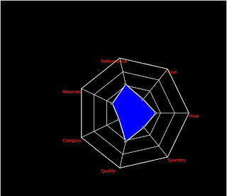
Radar Chart/Spider Web Chart-Powered by Aravind.

A Radar chart is
a graphical method of representing multivariate data in the form of a multi-dimensional
chart of three or more quantitative variables represented on axes starting from
the same point. The relative position and angle of the axes is typically
uninformative.
Radar chart is a
part of next generation charts and also called as web chart, spider chart, and
spider web chart.
In a radar chart, a point close to the center on any axis indicates a low
value. A point near the edge is a high value. In the football example, we would
high marks near the outside due to the nature of what was being measured. In
other scenarios, you might want points near the center, or low values. When
you're interpreting a radar chart, check each axis as well as the overall shape
to see how well it fits your goals.
Radar chart developed in silverlight!
Yes. I have
developed radar chart using silverlight technology. Some of the basic concept
behind the radar chart is explained below.
1.
Inputs
required: (graphset) Number of axes, total chart height depending on axis
length.
2.
Logic
to build the axis: Need to develop logic to have number of axis.
i.e 4-5 axis with minimum and
max height of the axis.
Next, depending on the number
of axis, spread those axes equally across the circle over the canvas.
3.
Mark
the provided values on canvas and join the dots between the axis as show in the
above image. (plot area)
4.
Fill
the color within the chart area.
This radar chart
supports series of arrays containing single or multiple datasets.
Example:
Series: [
{values:
[x0,x1,.....Xn]},
values:
[x0,x1,.....Xn]},
values:
[x0,x1,.....Xn]},
values:
[x0,x1,.....Xn]},
values:
[x0,x1,.....Xn]}
]
When to use it:
A radar chart shows how a team has evaluated a number of organizational
performance areas. It is
therefore essential that the initial evaluation include varied perspectives to
provide an overall
realistic and useful picture of performance.
Radar chart statistics:
For the radar chart, the following statistics are calculated:
Mean: the average of all the values
in the series.
Maximum: the maximum value in the series.
Minimum the minimum value in the series.
Sample Size the number of values in the series.
Range the maximum value minus the minimum value.
Standard Deviation Indicates how widely data is spread around the mean
Limitations
Radar charts are primarily used to show differences and
commonalities in a surprising way, or
when one chart is larger in each variable than another, and
primarily for sequential measurements - where each variable corresponds
to a certain extent "better" and
all variables are on the
same scale.
Conversely, radar
charts have been criticized for being poorly suited to mutual settlement decisions - one chart is larger for some
variables than another, and smaller for others.
Further, it is difficult to visually
compare the lengths of
different spins, as it is difficult to estimate the radial distance, although concentric circles help
as lattice lines. Instead, you can use simple linear graphics, especially for time series.
Please contact if
code/help needed on developing Radar Chart
contact: aravindbenator@gmail.com
This comment has been removed by the author.
ReplyDelete